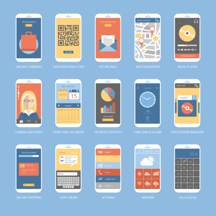
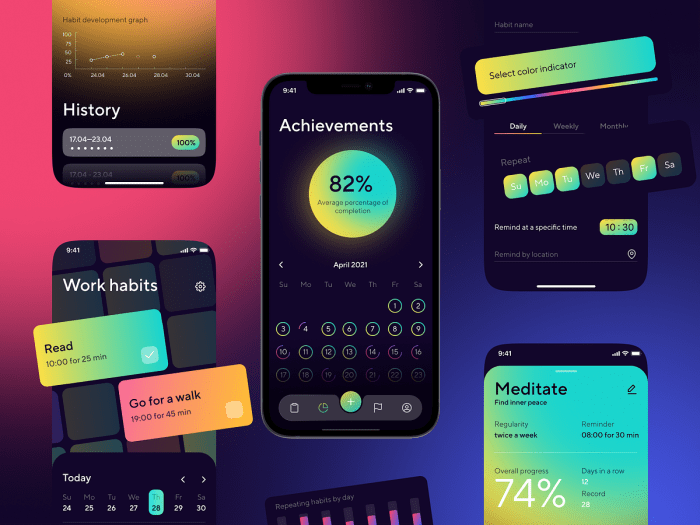
Designing for Mobile Users dives into the world of mobile-friendly design, offering insights on best practices and user experience considerations. Get ready to explore the latest trends in mobile design with a focus on aesthetics and functionality.
Importance of Mobile-Friendly Design

In today’s digital landscape, designing for mobile users is crucial for the success of any website or application. With the increasing number of people accessing the internet through mobile devices, it is essential to provide a seamless and optimized experience for mobile users.
Mobile and desktop user experiences differ in various aspects, such as screen size, input methods, and user behavior. Mobile users often have limited screen space, touch-based navigation, and a need for quick access to information. Designing specifically for mobile devices allows for a tailored experience that considers these differences and ensures usability and accessibility.
Mobile-responsive design not only improves user experience but also enhances user engagement. By providing a responsive and user-friendly interface, mobile-friendly designs can lead to increased user satisfaction, longer time spent on the site, and higher conversion rates. This, in turn, can positively impact business goals and overall success in the digital landscape.
Best Practices for Mobile Design
When designing for mobile users, it is crucial to follow best practices to ensure a seamless user experience. From intuitive navigation to responsive design, every aspect plays a significant role in creating a successful mobile interface.
Creating Intuitive Navigation
- Simplify menu options and navigation paths to reduce clutter and confusion.
- Use recognizable icons and symbols for common actions to enhance user understanding.
- Implement gestures like swiping and tapping for easy interaction with the interface.
Optimizing Images and Content
- Compress images to reduce loading times and improve performance on mobile devices.
- Use responsive images that adjust based on screen size to maintain quality and clarity.
- Optimize content for mobile reading by breaking up text into smaller chunks and using legible fonts.
Importance of Responsive Design
- Ensure your website or app adapts seamlessly to different screen sizes and orientations.
- Utilize media queries to customize layouts for various devices and resolutions.
- Test your design on different devices to guarantee a consistent experience across all platforms.
- Consider the most common tasks users perform on mobile and prioritize features that support these tasks.
- Use analytics data to identify popular content and features that should be prominently displayed on the mobile interface.
- Implement a clear hierarchy of information to guide users to the most important content first.
- Utilize responsive design techniques to adapt content and features based on screen size and device capabilities.
- Instagram: The Instagram app offers a clean and intuitive interface, allowing users to easily scroll through photos and engage with content.
- Google Maps: Google Maps provides a seamless navigation experience with real-time updates and personalized recommendations.
- Calm: The Calm meditation app offers a calming and visually appealing design, making it easy for users to relax and unwind on their mobile devices.
User Experience Considerations: Designing For Mobile Users

User experience plays a crucial role in mobile design as it directly impacts how users interact with a website or application on their mobile devices. A seamless and intuitive user experience can lead to increased engagement, satisfaction, and conversion rates.
Content and Feature Prioritization, Designing for Mobile Users
When designing for mobile users, it’s essential to prioritize content and features based on their importance and relevance to the user. This involves identifying key information that users are likely to seek and ensuring easy access to it. By prioritizing content and features, designers can streamline the user experience and make it more efficient for mobile users.
Successful Mobile User Experiences
Successful mobile user experiences are characterized by their simplicity, speed, and relevance to the user’s needs. Here are some examples of effective mobile user experiences:
Mobile Design Trends
In the ever-evolving world of mobile design, staying on top of the latest trends is crucial to creating visually appealing and user-friendly experiences for mobile users. Let’s dive into some of the current trends shaping the mobile design landscape.
Dark Mode
Dark mode has gained immense popularity in recent years, offering users a sleek and modern interface that is easy on the eyes, especially in low-light environments. Many apps and websites now offer a dark mode option to cater to user preferences and reduce eye strain.
Gesture-Based Navigation
Gesture-based navigation is another trend that has taken the mobile design world by storm. With the rise of bezel-less smartphones, gestures have replaced traditional buttons for seamless navigation. Users can swipe, pinch, and tap to interact with apps, providing a more intuitive and immersive experience.
Influence of Mobile Apps
Mobile apps play a significant role in shaping design trends, as they set benchmarks for user expectations. Popular apps like Instagram, TikTok, and Snapchat constantly innovate their designs to stay ahead of the curve, influencing other app developers and designers to follow suit.
Balancing Aesthetics and Functionality
Finding the perfect balance between aesthetics and functionality is key in mobile design. While a visually appealing interface can attract users, it must also be intuitive and easy to navigate. Designers must prioritize usability while incorporating trendy elements to create a seamless and engaging user experience.
